Industrial Design & CMF Strategy

A measured approach when launching a new diagnostic tool  

Case study: Aquascan for Salamander pumps

For an established brand and portfolio seeking expansion into adjacent categories, we crafted a naturally trusted diagnostic aesthetic where the colour and material choices reinforced the brand's credibility and market authority.

A lozenge shaped colour block showcasing colour palette used for the product, black, red, grey, lime green and solid brass all in varying textures and levels of gloss.

Brand accent colour

Introducing Brass, synonymous with precision and quality in this sector

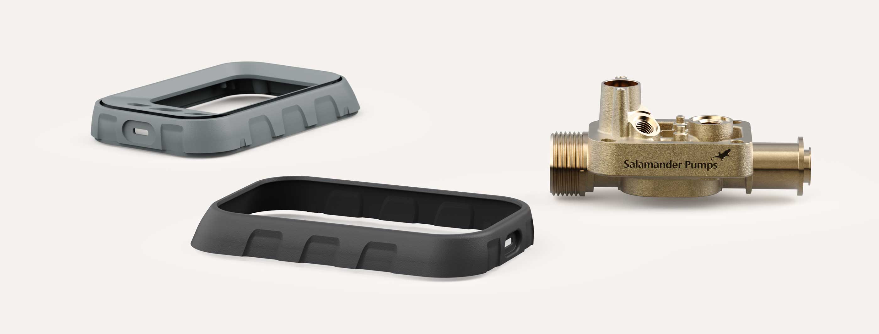
Two black and grey rectangular injection moulded product housings alongside a brass sensor housing component on a plain white background.
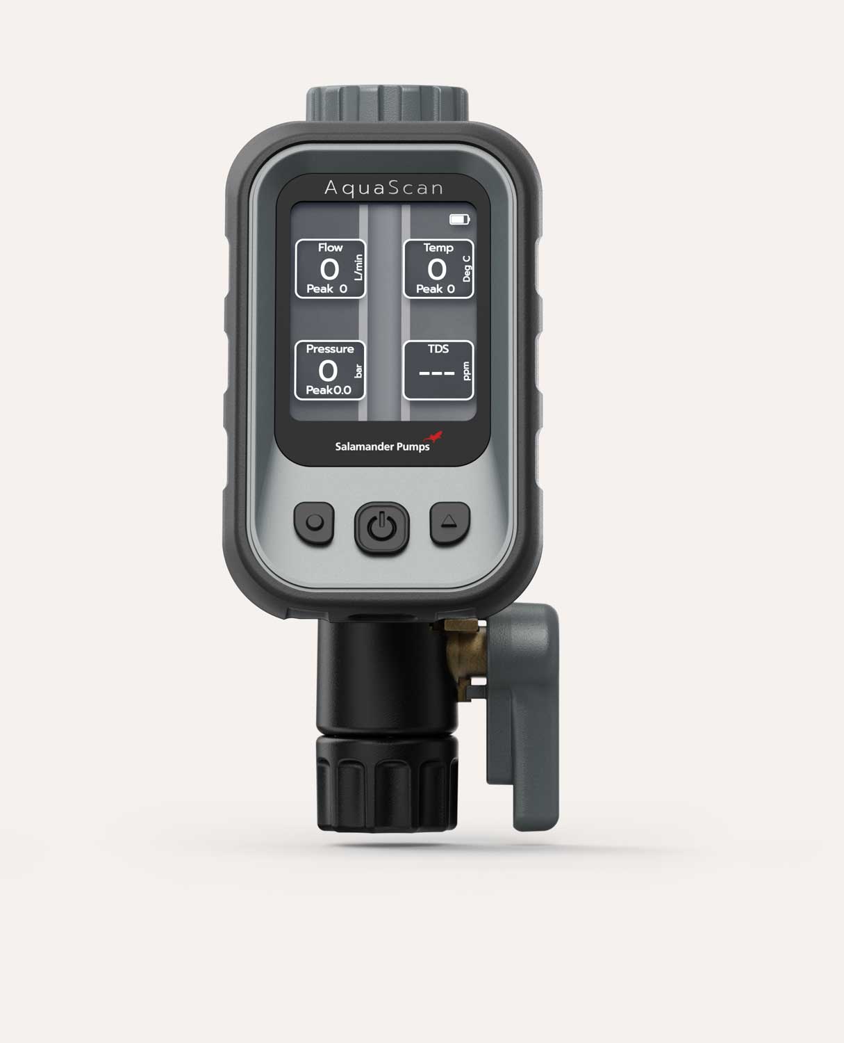
Aquascan digital water monitoring device by Salamander Pumps showing flow, temperature, pressure, and TDS readings on screen with control buttons below.

Clear, simple, without distraction

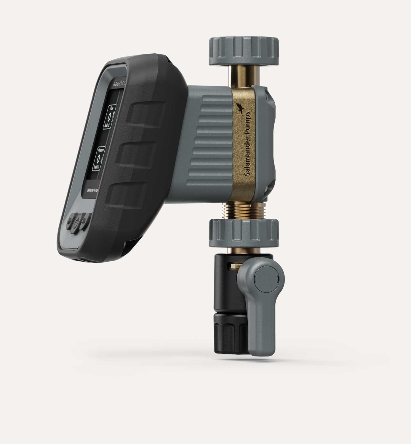
Compact digital water meter labelled Salamander Pumps with a grey isolation knob, a black handle, and a digital display screen showing flow and pressure readings.

Tactile grip points and relief

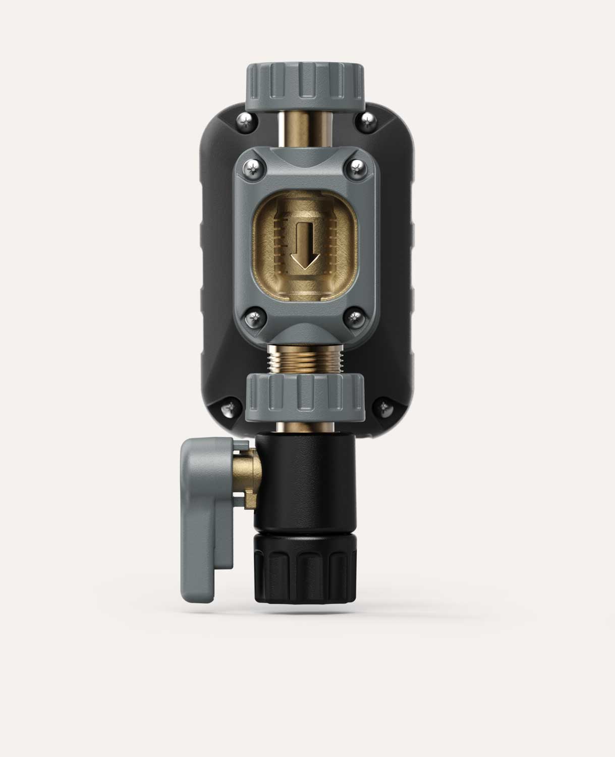
Close-up front view of the back of the water measuring device showing the brass and black valve casing with grey isolation knob and an in-moulded arrow  indicating flow direction.

Recessed brass quality cue  

Enhanced brand recognition  

Case study:
CBAM 25
the World's Fastest 3D Printer

The primary business objective was to strengthen brand presence within this highly competitive market. By integrating the brand deeply into the product's physical CMF, the solution focused on improving user interface through intuitive, color-coded interaction points that simplify both daily use and long-term maintenance.

From:

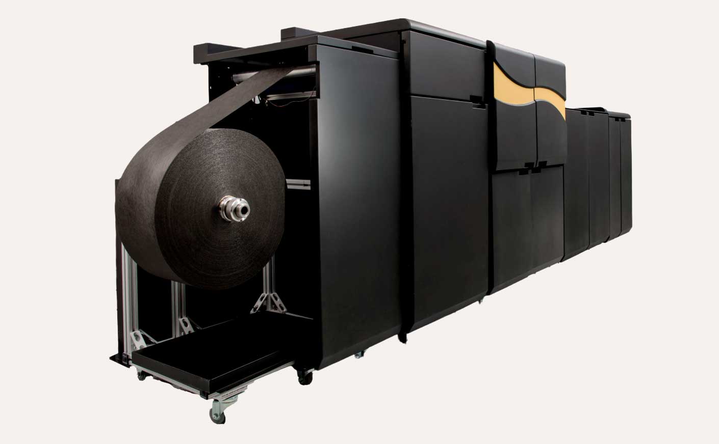
An unassuming yet imposing enclosure for a room-sized 3D printer.

Large industrial 3D printer labeled CBAM 25 with a person in a white lab coat standing next to it, advertising the world's fastest 3D printer for revolutionary manufacturing.
To:

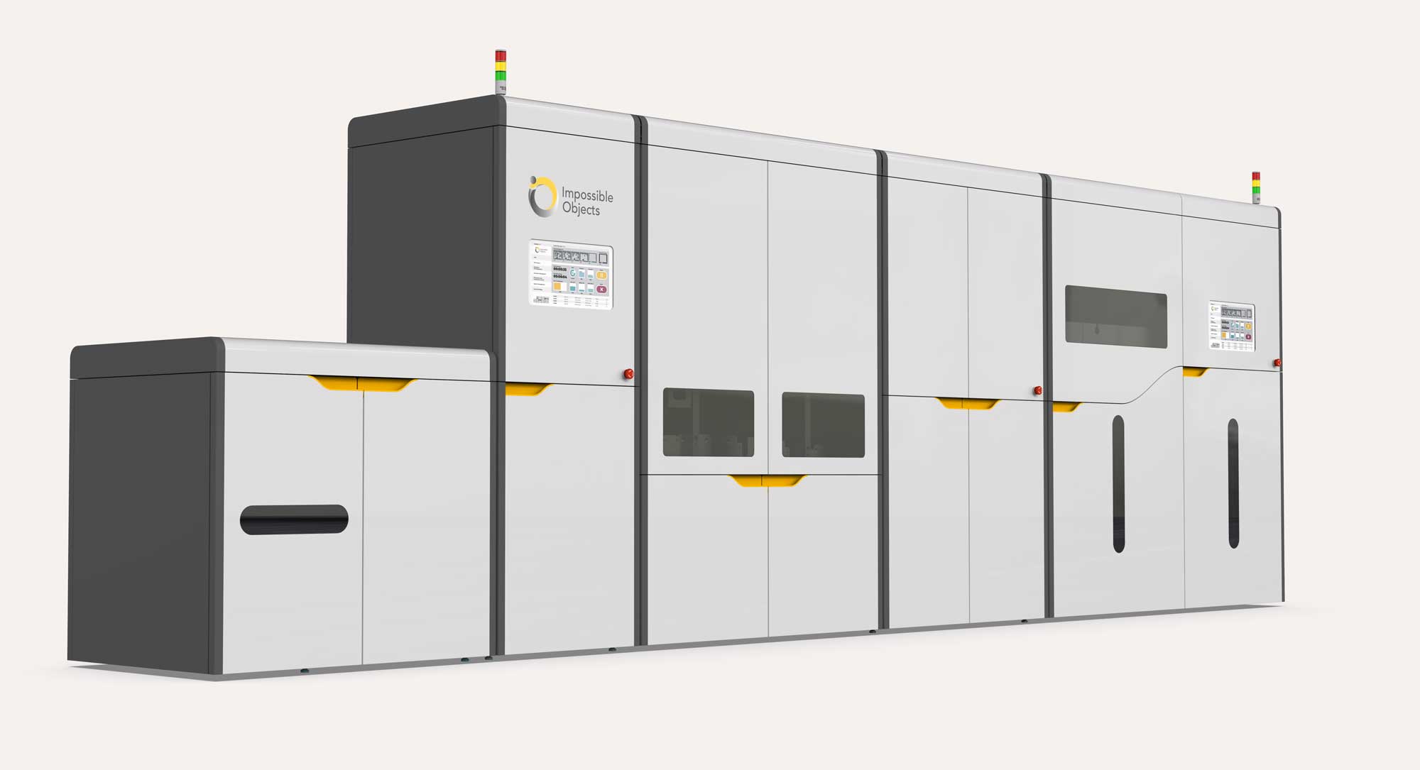
Bringing the world's fastest 3D printer out of the shadows. Using strategic colour application and refined user touchpoints turning an intimidating machine into an accessible, celebrated powerhouse.

Large industrial 3D printer machine with multiple connected white and black compartments, yellow handles, two small control screens, and vertical indicator lights on top, branded with Impossible Objects logo.
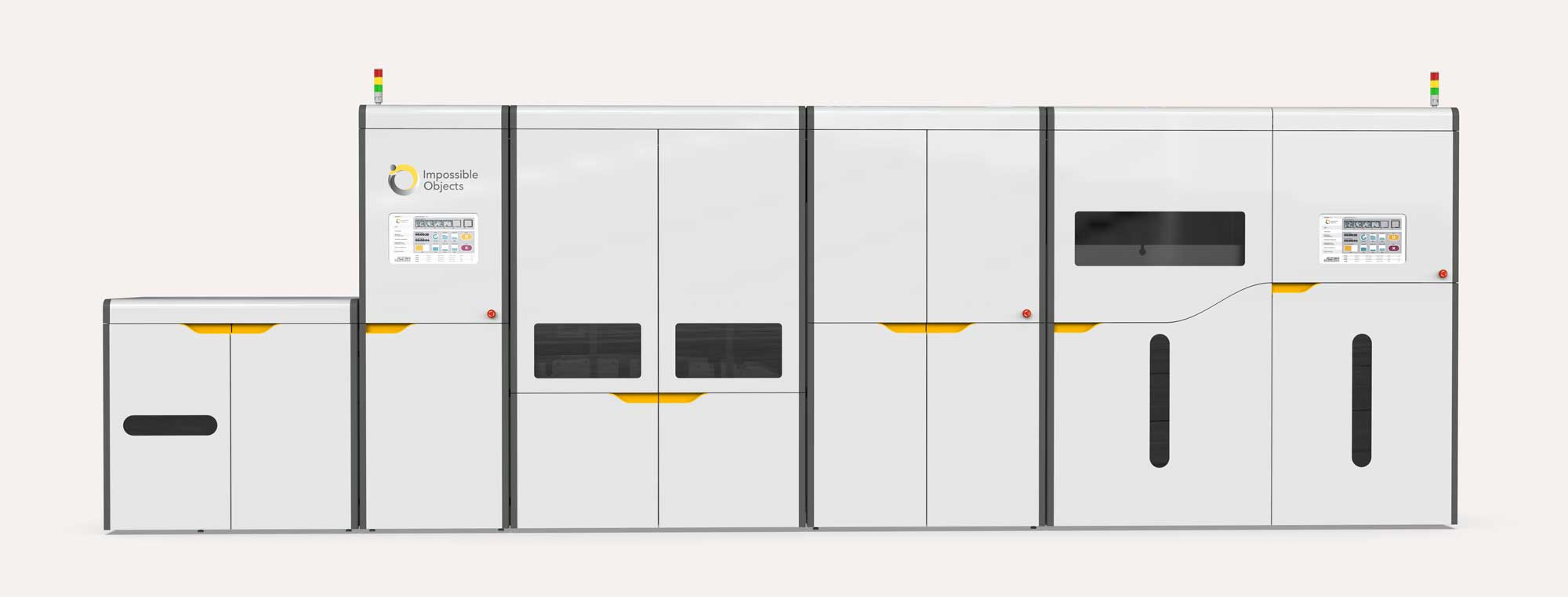
Front elevation view of a large, modern industrial 3D printer machine with multiple compartments and digital control panels, branded with Impossible Objects logo.

This CMF strategy does more than improve usability; it establishes a distinct visual identity. The result is a commanding presence, a visual anchor designed to build unmistakable brand recognition with every use.

Creating a colour scheme for a new category and technology  

Case study: steam cleaning

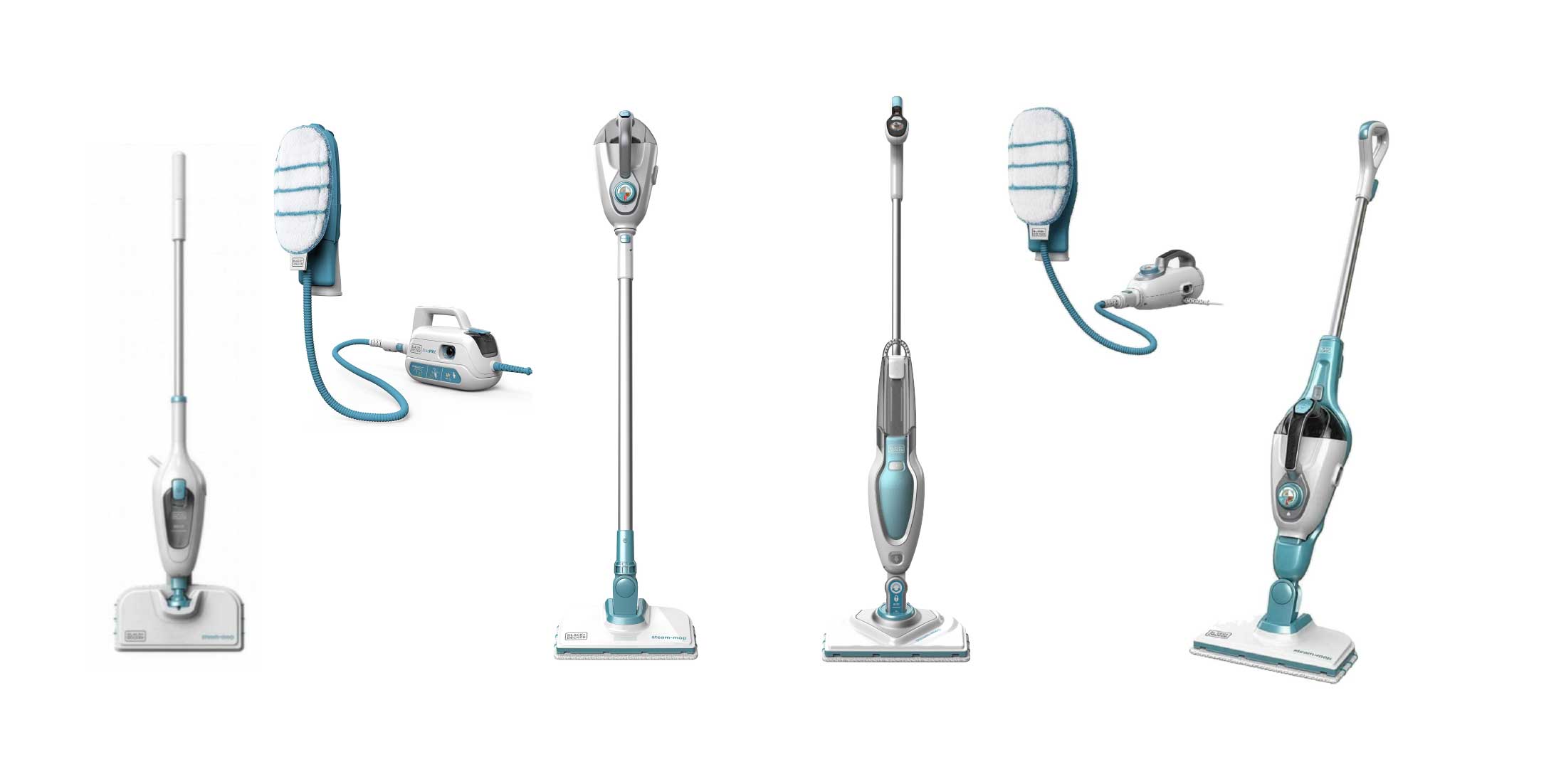
When introducing a chemical-free home cleaning system, selecting the right colour scheme is vital to instilling consumer confidence.

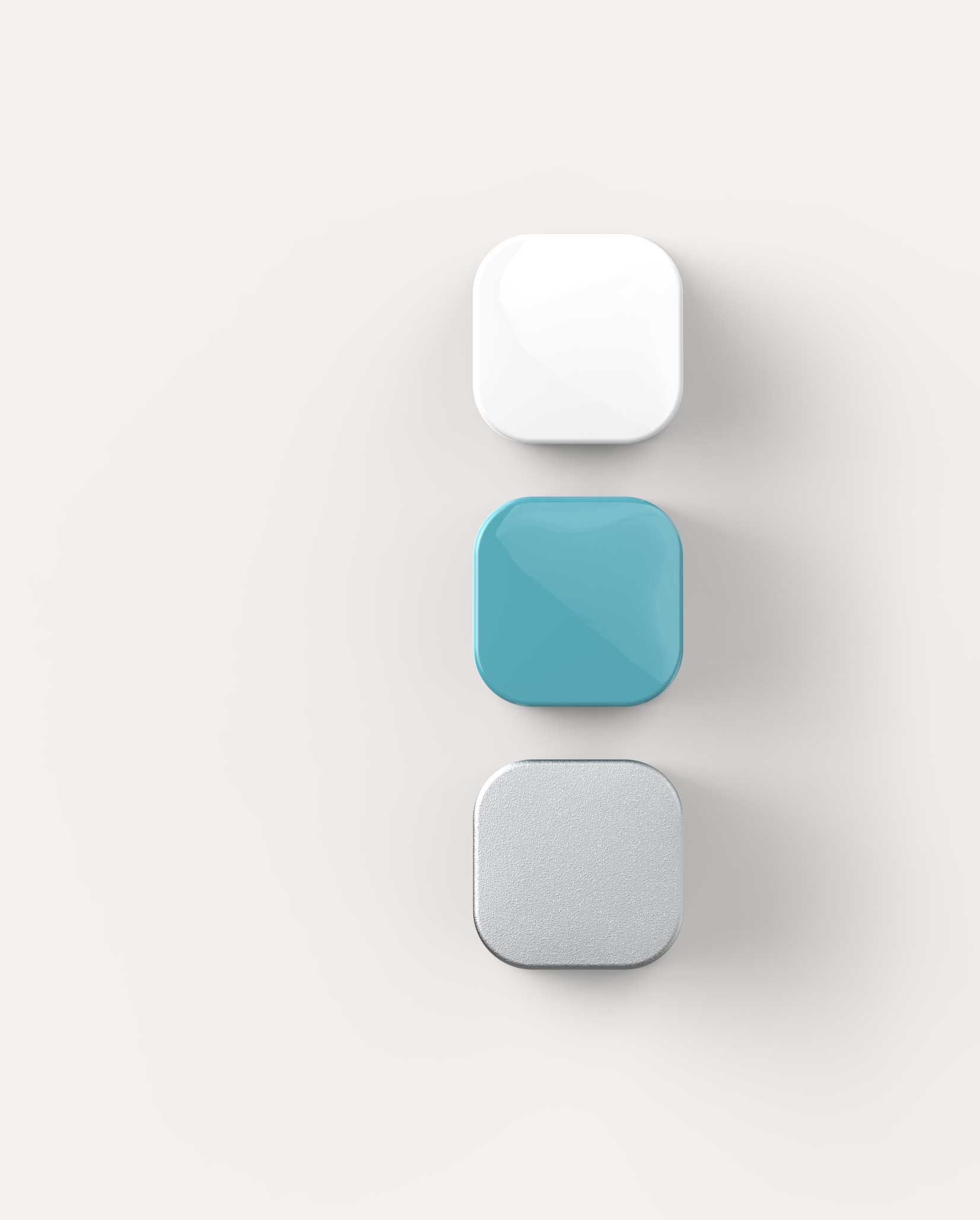
Use of colour theory to tap into innate psychological associations with cleanliness and hygiene. A carefully curated colour scheme to help build trust, reassuring customers that water alone can effectively sanitise the home and eliminate 99.9% of bacteria.

White =
hygienic
clinical
Aqua =
calm
water  
Silver =
technology
premium
Three square-shaped blocks with rounded edges sat on the page: white glossy top, teal glossy middle, and textured silver bottom on a neutral background.
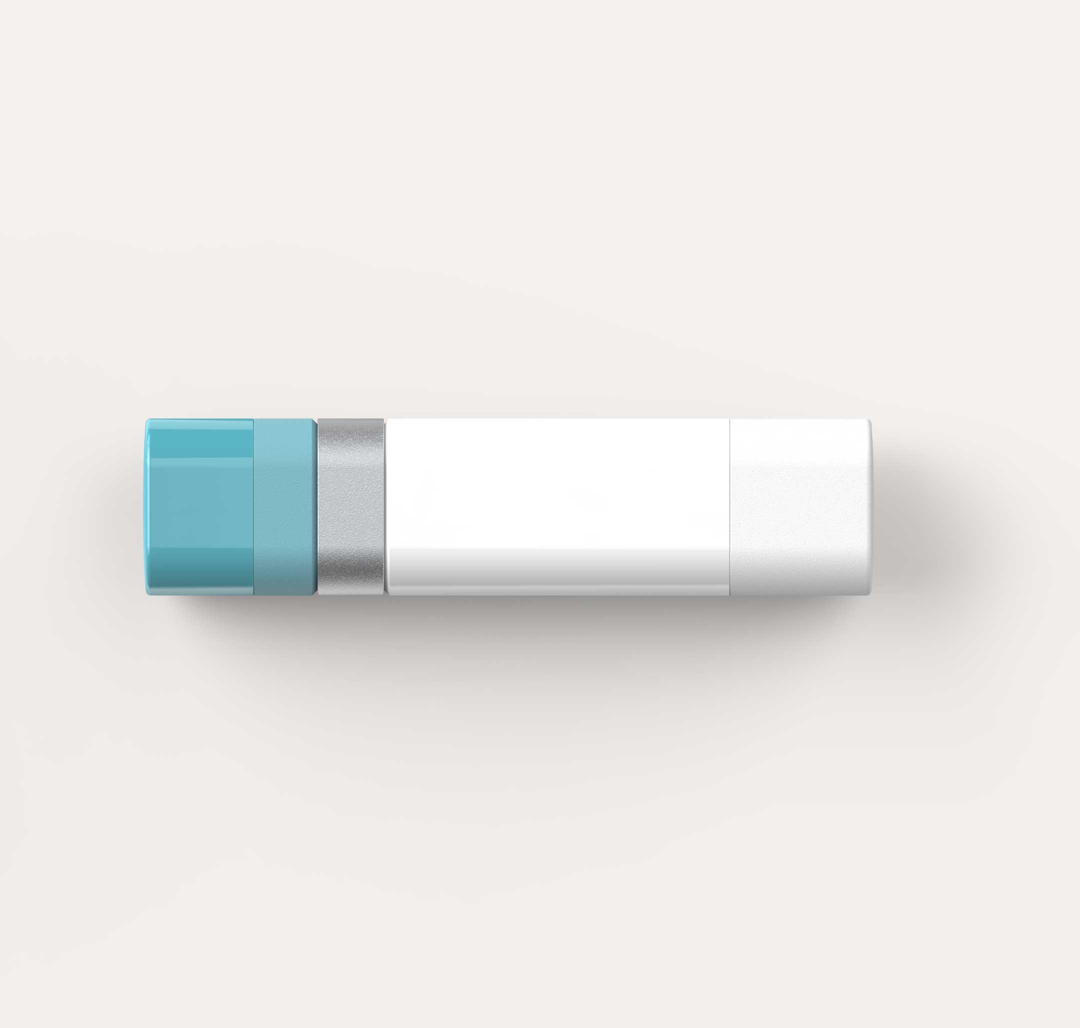
A lozenge shaped colour block showcasing colour palette used for the product, white, aqua blue, and silver all in varying surface textures and levels of gloss on a light background.

By carefully balancing these colors, we project trusted technical performance alongside clean, hygienic simplicity. Carefully curated surface finishes add a crucial tactile dimension, avoiding cheap looking excessive gloss while utilising custom textures to ensure the product feels right at every touchpoint.

Navigating the balance of colour and visual hierarchy across extensive product portfolios

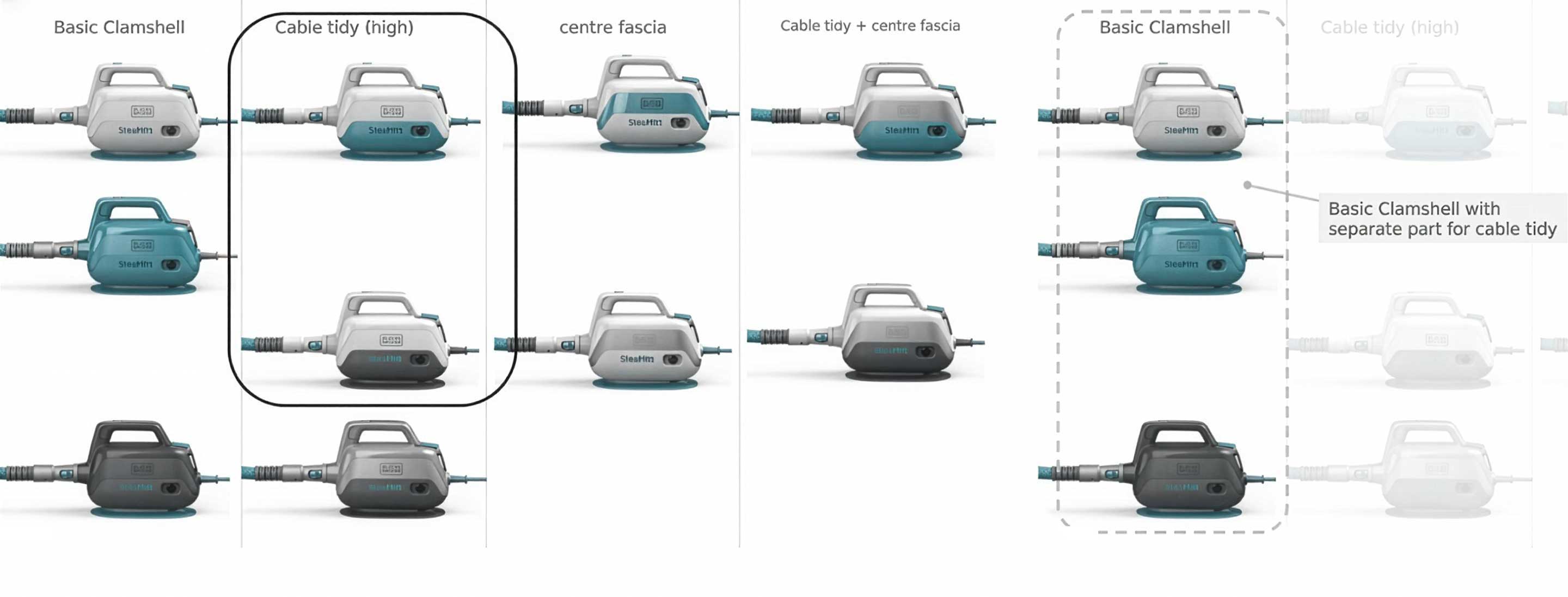
To strike the right balance when presenting design options to key marketing and manufacturing stakeholders, we transparently communicate trade-offs. Our evaluation balances component counts, colour break proportions, and your tooling investments against operational margins, assembly complexity, and payback periods.

Looking beyond initial production, we design for the full product lifecycle by accounting for high-wear areas and natural patina, utilising strategic surface textures to keep the finish durable and fit for purpose over time.

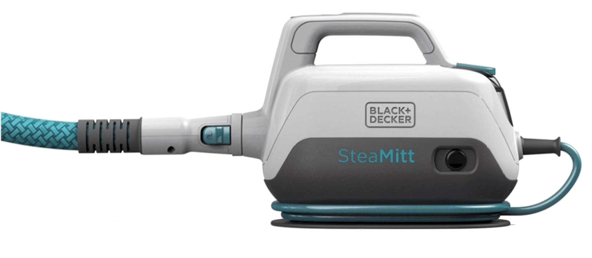
 a colour option sheet to help chose a path for the products colour scheme  containing renders showing the side views of 17 steam cleaner designs in varying colour options from all white to all aqua, some with grey bases.Black+Decker SteaMitt steam cleaner with a handle, a blue patterned hose, and a cord wrapped at the base, designed for fabric steaming and cleaning.
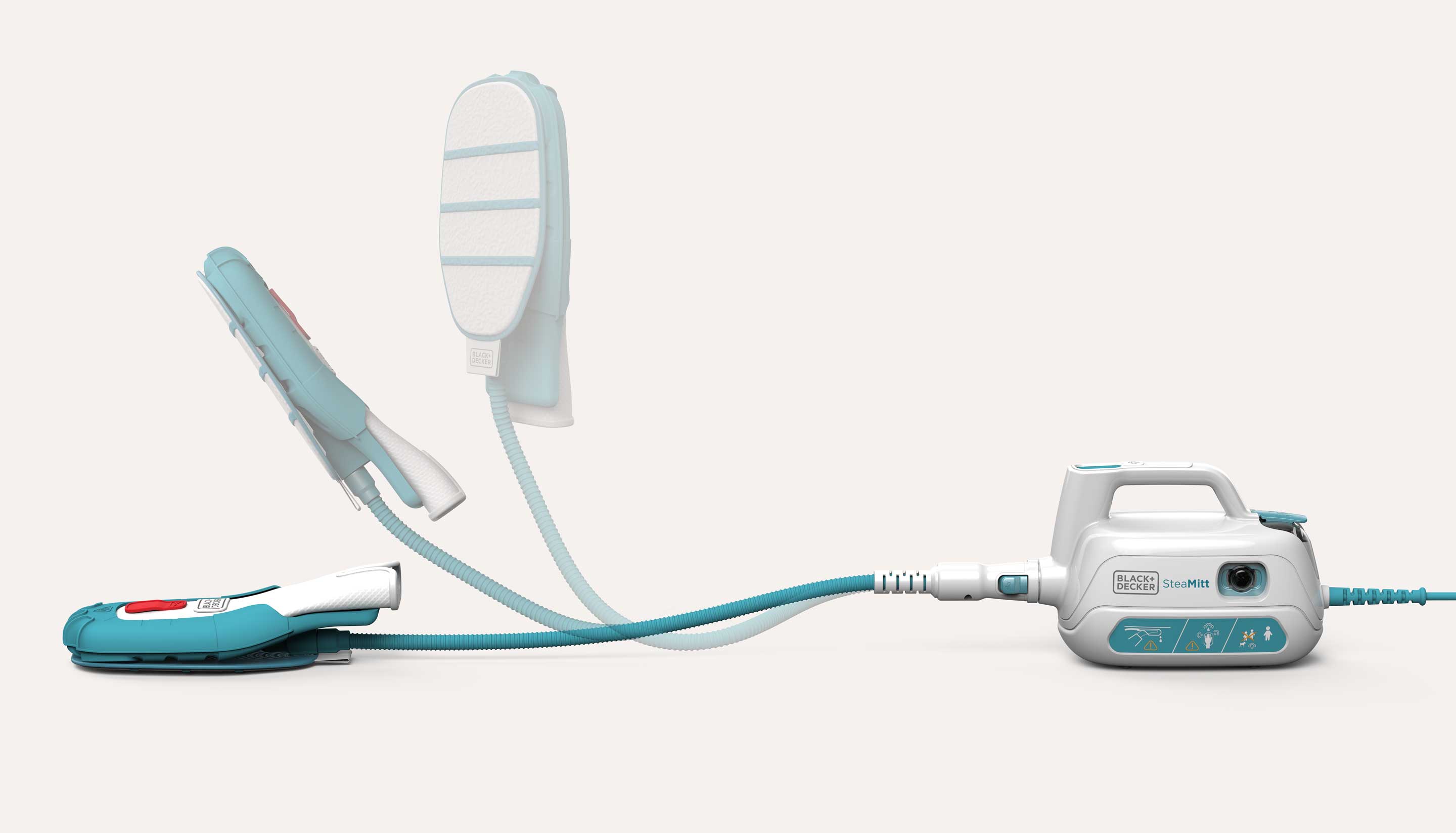
Black + Decker SteaMitt handheld cordless steamer with attached steaming mitt, connected by a flexible hose to a compact white and teal steam generator unit.

The result: trusted CMF + product

+$150 million EU 5 year turnover

Highly successful category expansion

Naturally trusted aesthetic

Saving extra marketing explanation, because the CMF supported the narrative.

Four steam mop models in white and aqua blue with rectangular cleaning pads and two handheld steamers with microfiber pads connected by hoses.

Working with an established brand colour palette

Case study:
DeWalt + a new pouch cell battery technology

A warning signal in nature, yellow, has become an intrinsic part of the signature palette and forms a vital pillar of DeWalt’s brand equity and legally protectable trade dress.

While leading global design center teams and the digital visualisation studios within Stanley Black & Decker, reach design's founder helped navigate visual consistency across product design, launch collateral, and digital media to safeguard this iconic identity.

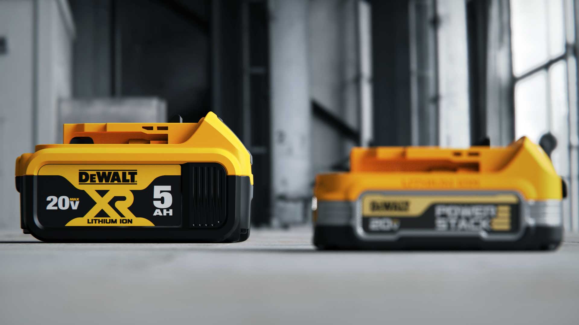
The Technical Product Story (TPS): Generating market excitement for a new compact cell technology in a hyper-competitive landscape, without cluttering the brand’s core visual identity or adding complexity to global manufacturing.When introducing a major technological leap, teams are often tempted to reinvent the wheel, but brand dilution is a costly risk. We bring the experience needed to steer past unnecessary "newness," ensuring your next flagship launch commands attention while fiercely protecting your foundational identity, delivering results that satisfy brand guardians, design studios, executive boards, supply chains and global markets alike.  
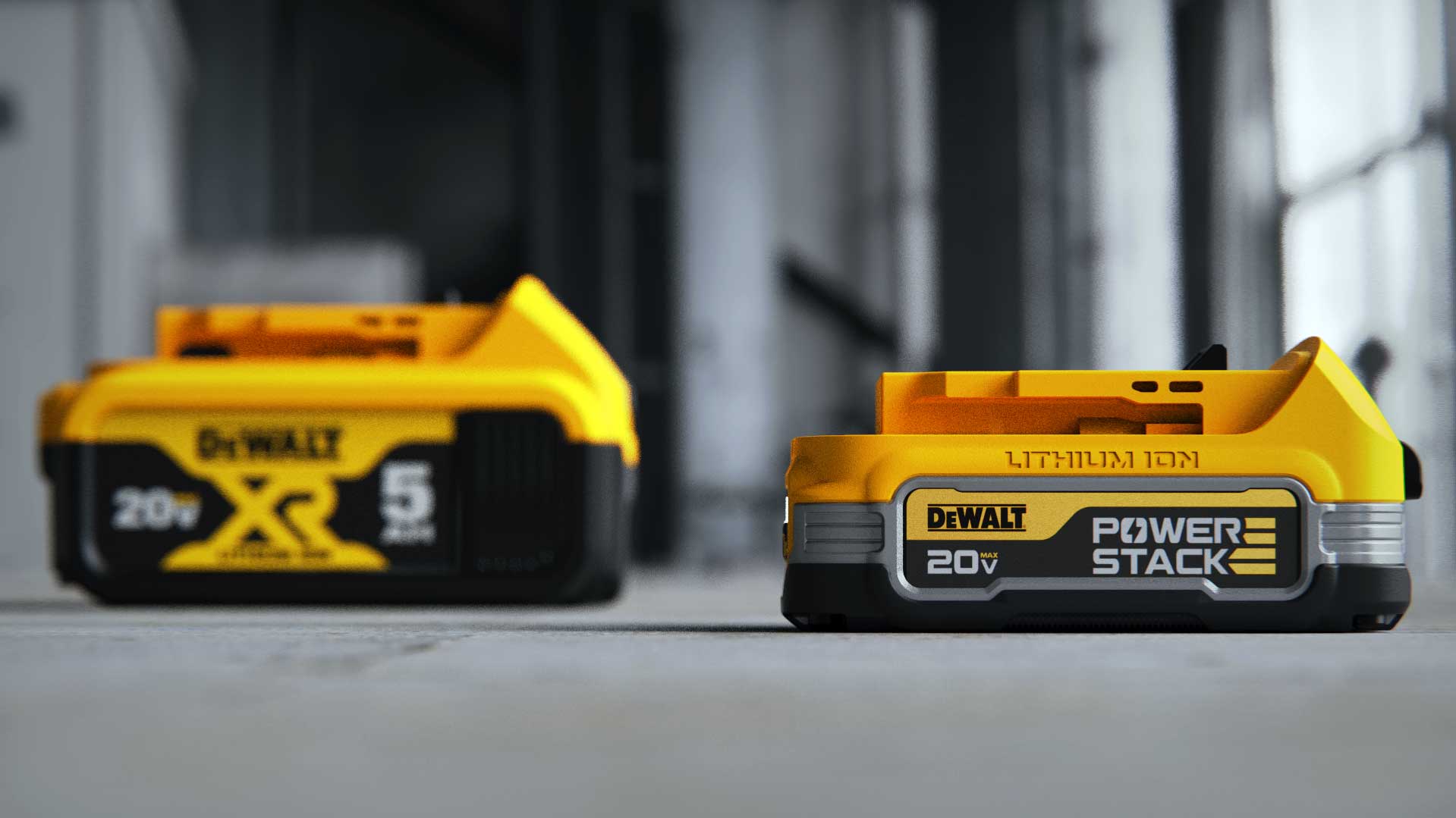
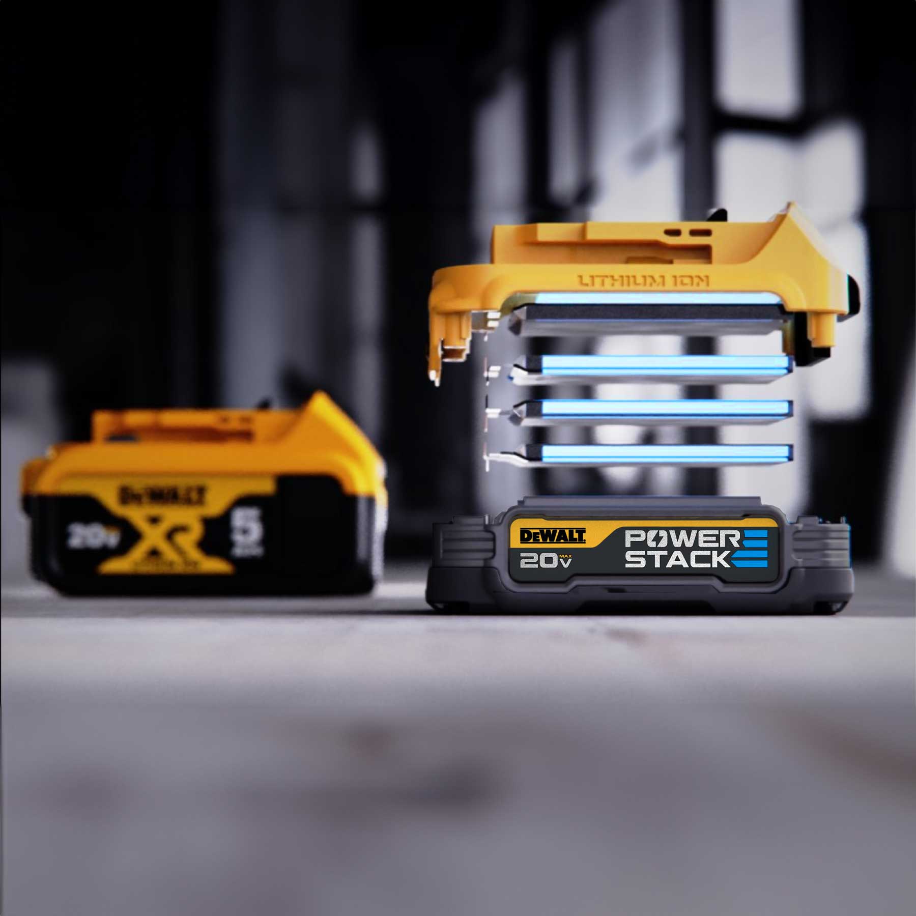
Close-up of two yellow and black DeWalt 20V XR lithium-ion power tool batteries on a concrete floor in an industrial setting.Two DeWalt 20V batteries on a gray surface, one close-up labeled Power Stack and one blurred in the background labeled XR and 5 Ah.
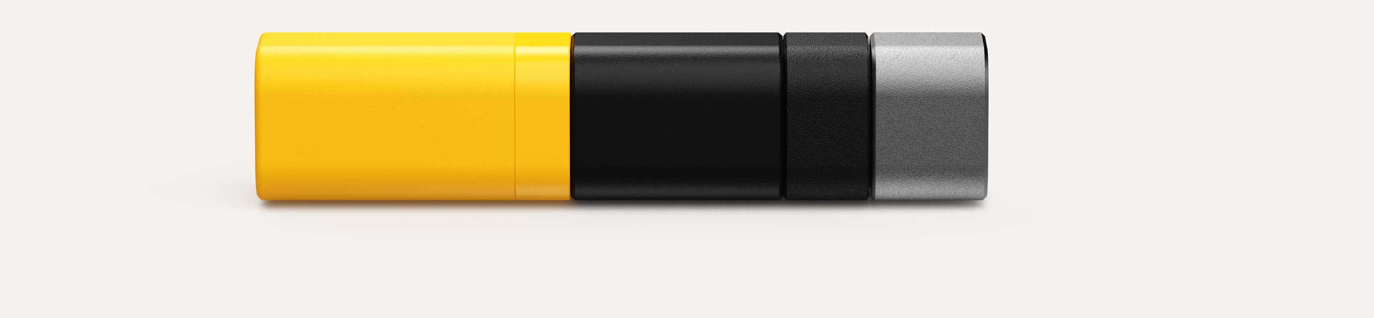
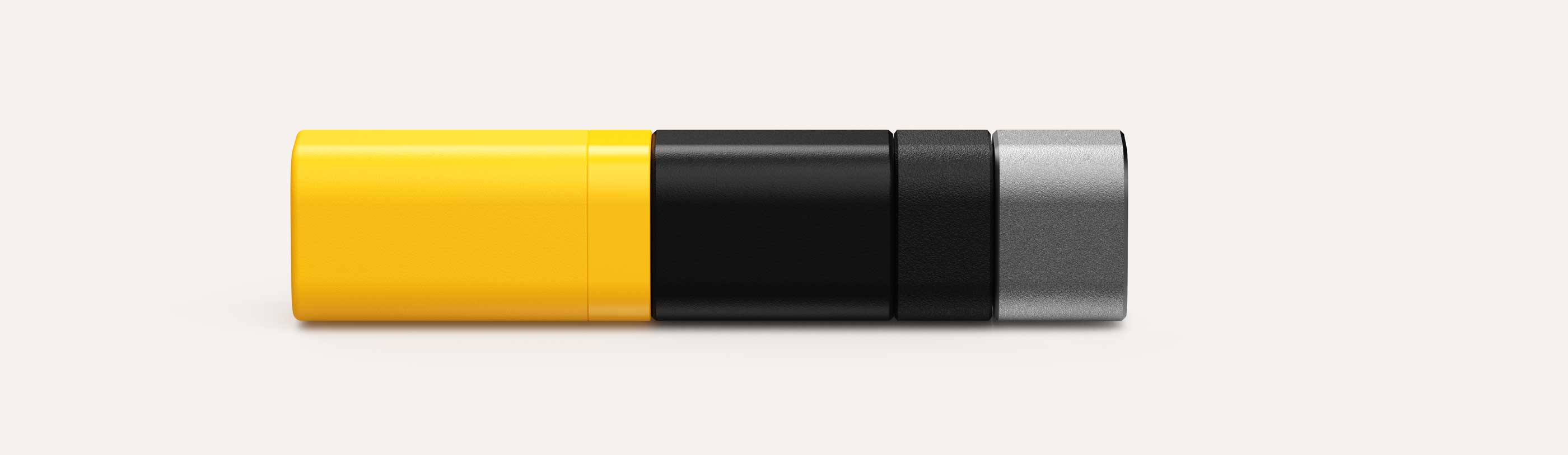
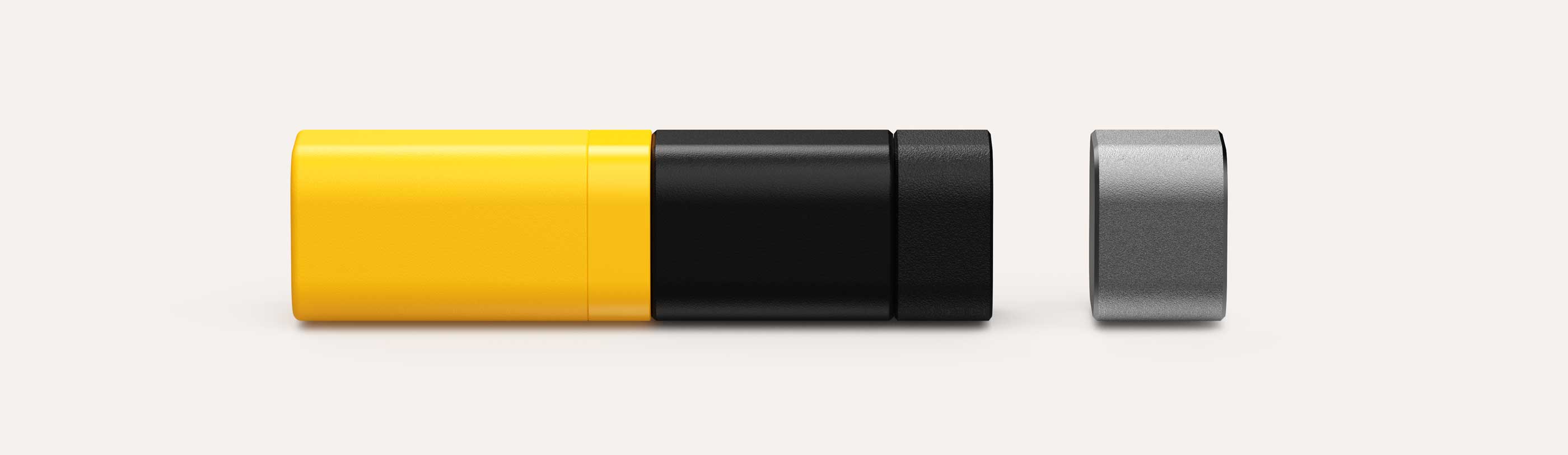
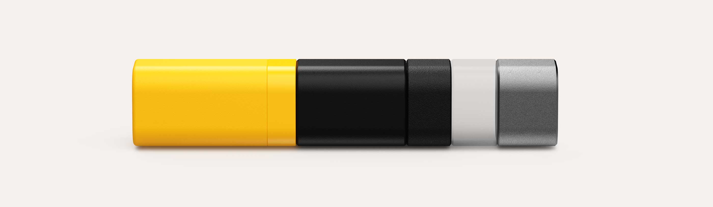
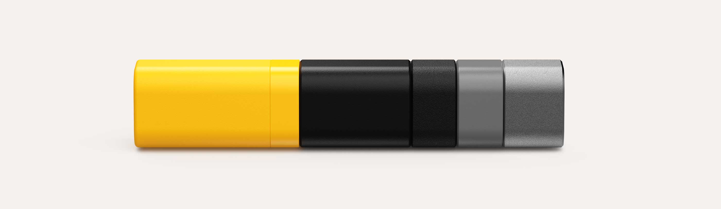
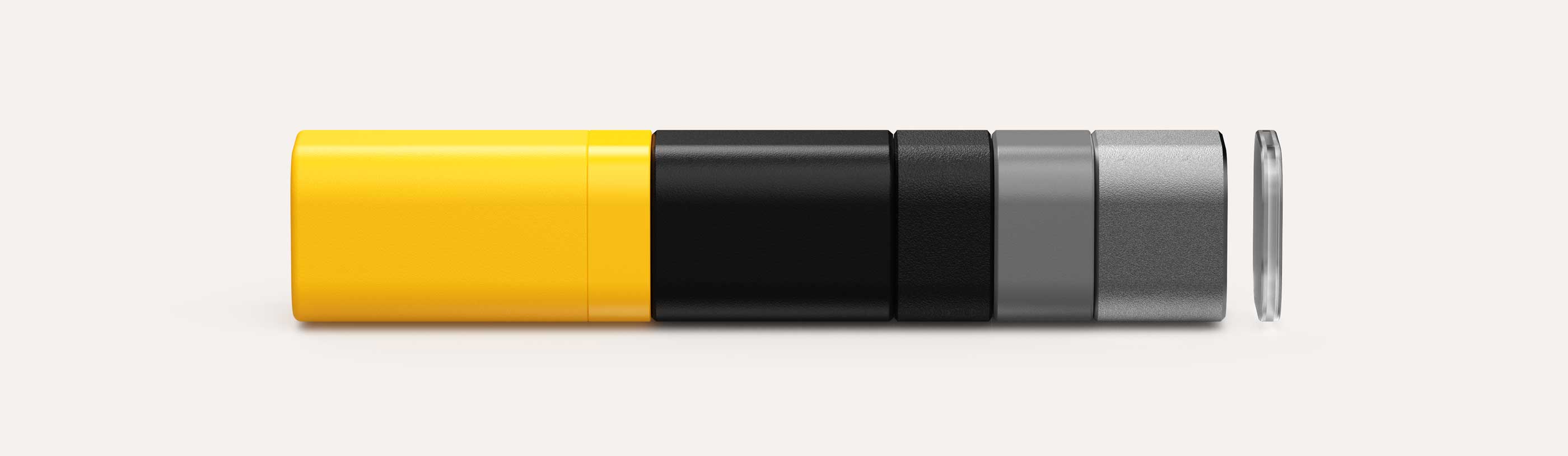
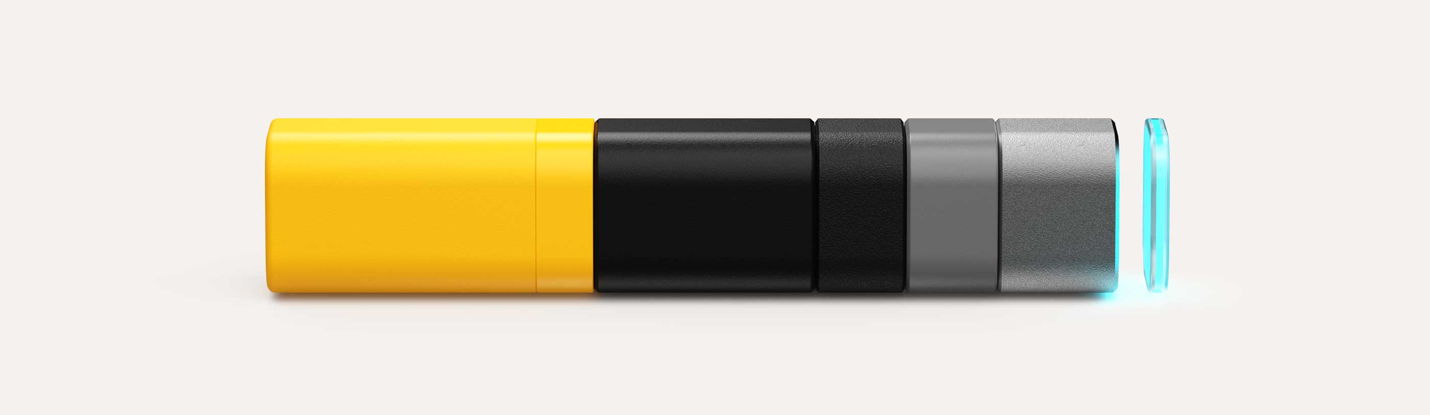
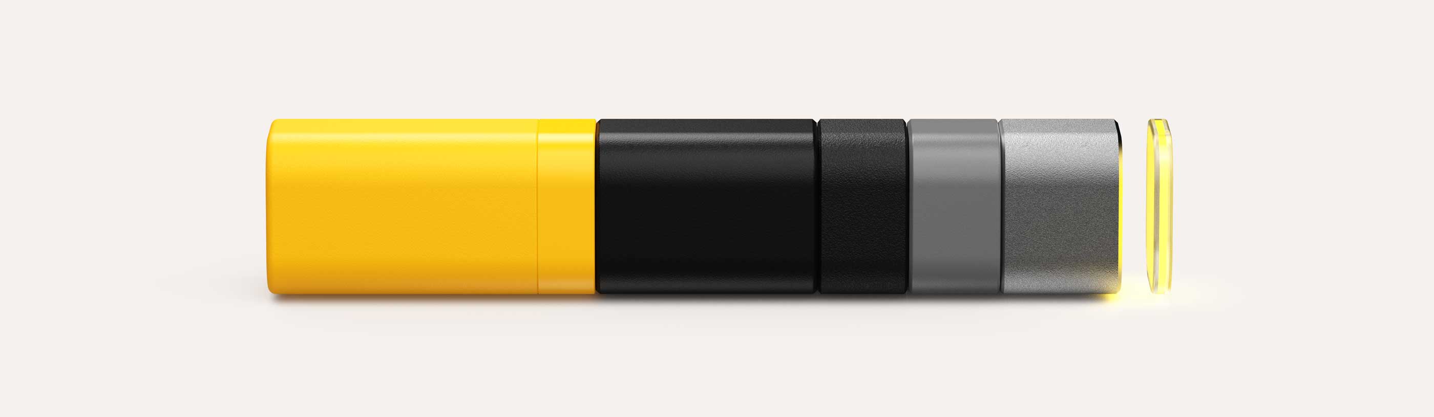
A lozenge shaped 3D colour swatch segmented into four parts with colours from left to right: yellow, matte black, textured black, and metallic grey.

Moulded colour and surface texture swatch

If it isn't broken, don't try and fix it and certainly do not dilute it. Work to complement not complicate it, example here of adding a moulded dark grey to complement the silver and differentiate on product.

Lozenge Layer 1Lozenge Layer AbsoluteLozenge Layer AbsoluteLozenge Layer AbsoluteLozenge Layer AbsoluteLozenge Layer AbsoluteLozenge Layer Absolute

Pixels are 'free' the blue accent is purely digital + migrates back to glowing yellow.
Calling attention to the feature while avoiding dilution, complexity in POS and supply chain.

Close-up of a DEWALT 20V MAX POWERSTACK battery with stacked electric cells displayed next to a blurred yellow and black DEWALT battery in the background.

POWER STACK

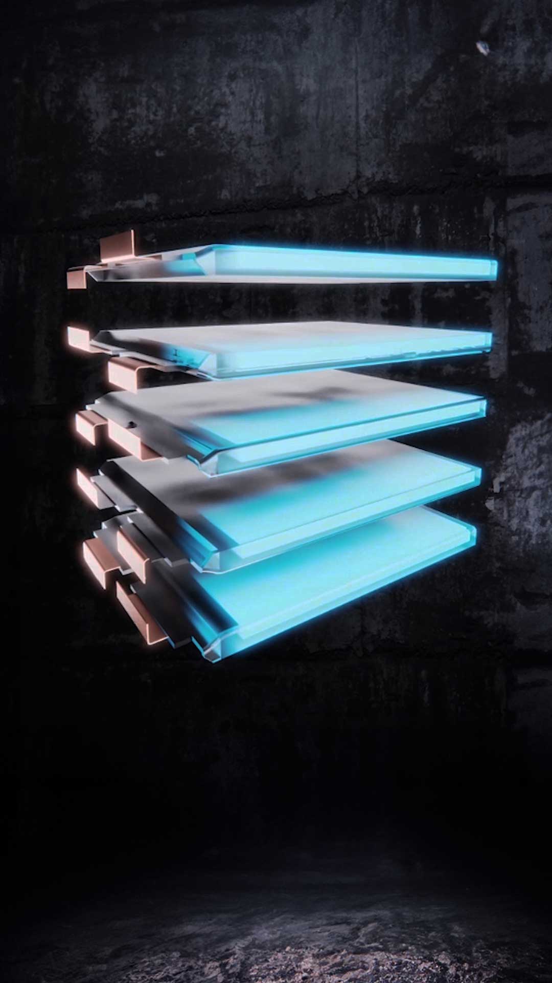
The Award winning launch for a new type of high density lithium pouch cell technology.

Glowing, translucent, stacked rectangular lithium pouch cell panels floating against a dark textured background, each panel outlined with a soft blue light and attached by copper coloured connectors on one side.

How we approach a new brand and market

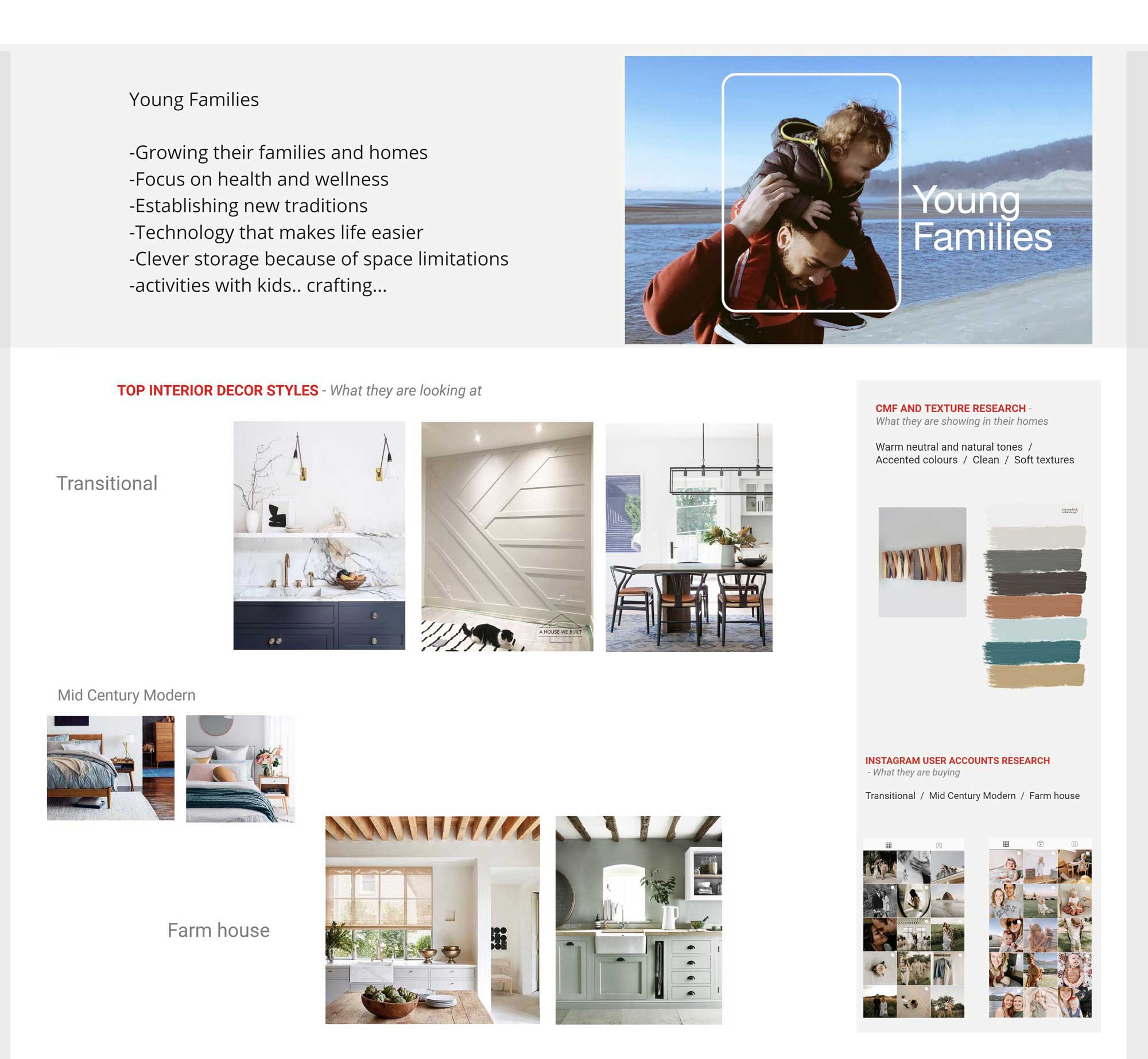
When developing a fresh product proposition, conducting colour research into market shifts, adjacent sectors, and competitor landscapes is essential to identifying the optimal strategic fit. By aggregating pertinent consumer interior trends, we can establish a robust foundation to inform a cohesive colour palette for your new range.

These critical insights monitor the global economy and shifting public sentiment, providing the navigation needed to track where colour preferences are heading. Often, by analysing historical tones and their specific economic contexts, we can better project the future: from the optimistic pop palettes of the post-war 1950s and the stark minimalism of the early 2000s to the emerging retro-futurism gaining traction today.

Home interior trend board showing young families focusing on home growth, health, traditions, tech, storage, and activities; features top interior decor styles (Transitional, Mid Century Modern, Farmhouse) with images and Pinterest research on colours and Instagram trends.

The magic of the Marmite colour isn't in volume sales; it's in attention economics.   

A slate grey debut risks vanishing within a crowded market landscape. Conversely, an electric lime green execution demands visibility and commands the room.

Vibrant tones like lime green serve as a "Marmite" trigger, intensely loved by some and dismissed by others. Consider the Dyson purple or the Electrolux vacuum launch; by utilising pearlescent lime and acidic orange, Electrolux cut through a sea of monotonous grey to drive significant retail and online traffic. While traditional silver models eventually dominated actual sales, those bold units fulfilled a strategic purpose. Much like a carefully curated launch car, utilising high-impact colours pays dividends by securing interest, even if the volume remains in the conservative. 

At the point of purchase, the consumer's desire for "safe" integration into the home environment takes precedence. They choose the grey option because, across major consumer durables, neutrals secure 70% to 80% of volume sales.

Yellow chevron arrow pointing left on a black background.
get in touch and
create@reach.design
The link takes the reader back to the top of this home page, the graphic icon is in the shape of an arrow
back to the top